Analyze the data › Analysis Workspace
Analysis Workspace Overview
Think of a friend. What comes to mind first is their face. The voice, the job, the argument you had last year, all of that follows, but the face arrives first and everything else hangs off it.
Cities work the same way. Say Paris and you picture a tower. Say New York and you picture a statue. One image comes first, and the details attach to it afterward.
Now ask anyone who has used Adobe Analytics what the product looks like. Almost nobody describes a tracking call. They picture a screen: a table, a chart beside it, and a list down the left that they dragged things out of. That screen is Analysis Workspace, and for most of the people who use Adobe Analytics it is not a part of the product. It is the product.
Everything else in Adobe Analytics is upstream of this screen
That impression is not naive, and it is worth taking a moment over why it is so close to correct, because the answer is not that the screen is impressive.
A tracking call carries a value off a page. Report suite settings decide which values are switched on at all. Processing rules rewrite them on the way in, before any human sees them. Classifications attach readable labels to codes that were never meant to be read. Marketing channel rules decide which source gets the credit. Segments describe which visits are worth isolating. Calculated metrics turn two counts into a rate.
Not one of those produces a report. Every one of them is preparation, and each runs on its own, in its own screen, on its own schedule, answerable to nobody until the day somebody asks a question. They behave like rivers, which is to say that none of them is the destination and none of them means very much alone.
There is a consequence to sitting at the bottom of that funnel, and it is the reason this screen matters to people who never intend to build a report. Analysis Workspace is where an implementation becomes visible. A variable that was never enabled does not announce itself as a fault. It appears as an absence in a list, quietly, months after somebody signed off the specification that promised it. The gap between what a solution design reference says is being collected and what is actually being collected is discovered here more often than anywhere else.
A space where the work is analysis, and the name is the whole definition
Read the name literally and there is very little left to explain. A workspace is a space where work is done. The work here is analysis. That is the definition, and it is worth saying plainly because most descriptions of this feature open with a list of capabilities and never get around to what it is for.
Think about how a player spends their years. Technique, fitness, the rulebook, hours of it, and none of that is the point of any of it. All of it exists so that on the day they walk onto the ground they have something to use, and the ground is where it stops being preparation and starts being the thing itself. Everything named in the previous heading, the collection and the processing and the classifications and the segments, is that kind of preparation, and this screen is the ground.
What you get is a blank canvas, and the blankness is deliberate. There is no default report waiting for you, no prescribed starting layout, and no opinion about what you came to find out. You bring a dimension, you bring a metric, and a table appears. Then you bring a second table, a fallout, a flow diagram, a cohort grid, a line chart, and arrange them however the question needs. Winning here means one thing: a number that somebody can act on, pointed at a decision that was going to be made anyway, with or without data.
Any dimension, any metric, nothing refused
Here is the single fact that separates this screen from everything Adobe shipped before it. Every dimension in the list can be combined with every metric in the list. Not a supported subset. All of them.
That sounds ordinary until you know what it replaced. The interface that came before enforced the pairings. A prop could be reported against page views, visits and visitors. An eVar could be reported against events. Cross the two and the report was simply not offered.
Workspace refuses none of it. Drag any two things together and it builds the table, without asking whether the pairing was sensible, without a warning, and without any indication that it has just done something the previous generation of this product would have declined.
Where the freedom came from, and what had to die to get here
None of this arrived in one release, and the topic stays rigid and forgettable until you know the shape of what came before. There were two products, running in parallel for years, and Analysis Workspace is the survivor of both.
The first is the one everybody remembers. Adobe Analytics began life as Omniture SiteCatalyst, and Adobe acquired Omniture in October 2009. The reporting interface that came with it survived the rebrand under the name Reports & Analytics, in a distinctive green, and practitioners of a certain vintage still say the name with some affection.
It was also strict in a way that is hard to imagine now. One report to a view, and saving was how you kept anything. A segment could be applied above a report but never dropped inside it. If several reports needed to sit together, that was a Dashboard, and a Dashboard drew from exactly one report suite, so any question that spanned two properties was two screens and a spreadsheet. The prop and eVar rule described above was enforced throughout.
The second product is the one that actually became Workspace, and its ancestry runs through a different acquisition entirely. Omniture had bought Visual Sciences, whose high end data analysis engine Adobe later shipped as Adobe Insight and later still renamed Data Workbench. From roughly that period came Discover, a tool built for serious analysts rather than for report consumers: a dark themed desktop client with drag and drop, free combination of anything with anything, and none of SiteCatalyst's guardrails. Adobe renamed it Ad Hoc Analysis.
Ad Hoc Analysis had one enormous problem, and it is the hinge of the whole story. It was a Java desktop application. It had to be installed, it was tied to the machine it was installed on, and it broke whenever the runtime beneath it moved. Adobe announced the intention to end its life in August 2018 and pointedly refused to name a final date until Analysis Workspace had matched the workflows analysts depended on, which is not how a product is usually retired and says something about who was using it.
Analysis Workspace shipped in 2015 and is best understood as Ad Hoc Analysis rebuilt in the browser: the same interaction model, the same refusal to enforce pairings, the same audience. It is not a replica, and it did not arrive complete. It spent nine years absorbing the capabilities of both ancestors, and only when that was done did Adobe finish the job. Ad Hoc Analysis went first. Reports & Analytics reached end of life on 31 December 2023 and stopped working altogether on 17 January 2024, taking its scheduled reports and data extracts with it.
The move into the browser is the part worth pausing on, because it is easy to file as branding. Adobe put every business it had onto the cloud in that period, and in analytics the practical result was the removal of one dependency. No installation, no runtime, no machine that has the tool on it. Credentials and a browser, and the entire ecosystem is present: the data, the components, the projects somebody saved last year. That is not a convenience. For a tool whose users are constantly asked a question in a meeting they walked into unprepared, it is the difference between answering now and answering tomorrow.
| Reports & Analytics | Analysis Workspace | |
|---|---|---|
| Pairing a dimension with a metric | Props with traffic metrics, eVars with events. Enforced. | Anything with anything. Nothing is enforced. |
| Segments | Applied above the report, one at a time | Dropped onto a project, a panel, a column, or a single cell |
| Reports in one view | One | As many tables and visualizations as the question needs |
| Report suites in one view | One per dashboard | One per panel, and a project holds many panels |
| How it ran | Pre-built reports you chose from | Queries composed as you drag |
| Status | Stopped working 17 January 2024 | The reporting interface |
One detail from that history is still on screen today, and it is easy to walk past. Color has been carrying meaning in this product for twenty years. SiteCatalyst's green was a brand. Discover's dark theme was a signal about who the tool was for. The colors in Analysis Workspace are the first ones that carry actual information, and they are the next thing to understand.
What you are actually looking at
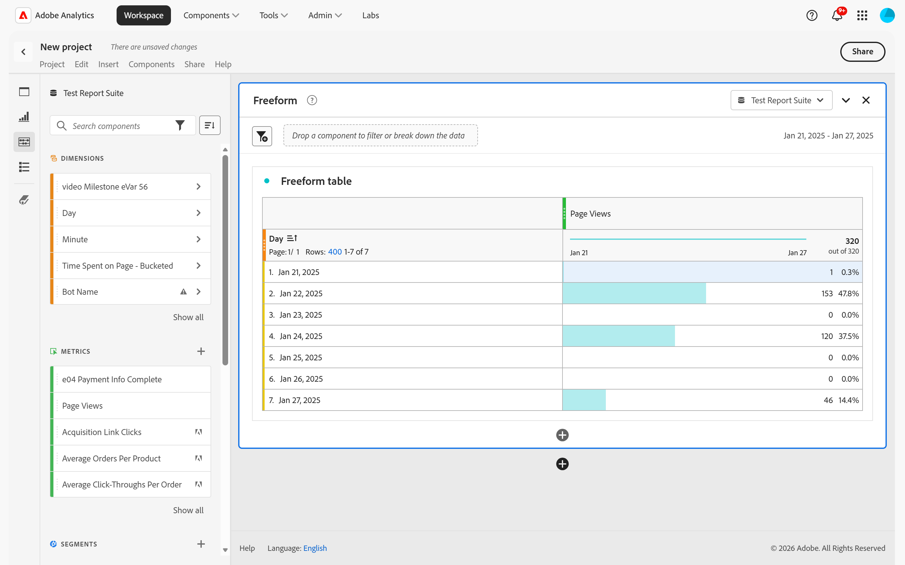
The layout is what any serious data tool converges on, and once the four regions have names the screen stops being busy.
Along the top is a menu bar that behaves the way every office application has behaved for thirty years. Save, rename, open, insert, share. There is nothing to learn there and it is deliberately unremarkable.
Down the far left edge is a narrow strip of five icons, and each one changes what the panel beside it shows. Panels, Visualizations, Components, Table of contents, and, below a divider, Data dictionary. Most people use the third one and never look at the other four.
The first three are worth noticing early, because they are close to a map of this module. Panels are the containers, and they decide the report suite and the date range, which is the subject of Projects and Panels. Visualizations are the shapes data can take, from a bar chart to a fallout to a cohort grid. Components are everything the rest of Adobe Analytics spent its time preparing. The freeform table is where all three meet.
The last two are conveniences rather than building blocks, and both are worth knowing exist. Table of contents lists every panel and visualization in the current project, which matters once a project is long enough to scroll. Data dictionary explains what a component actually means, including who defined it and whether an administrator approved it, and it is the fastest way to settle an argument about a number that somebody else built.
The large area to the right is the canvas, and everything on it lives inside a panel. A panel is the unit that owns a report suite and a date range, and the tables and charts inside it inherit both.
Four colors, and they are the fastest thing on the screen
Open the Components icon, third down the strip, and the list is color coded into four types. These are not decorative, they are not theme colors, and they are the one piece of visual vocabulary in this product genuinely worth committing to memory.
| Color | Type | What is in the list |
|---|---|---|
| Orange | Dimensions | Every place a value is stored. Enabled eVars and props under the names an administrator gave them, plus the dimensions Adobe provides by default. |
| Green | Metrics | Everything countable. Default metrics, custom success events, and every calculated metric saved to the suite. |
| Blue | Segments | Filters over the data. The ones you built, the ones shared with you, and the set Adobe ships. |
| Purple | Date ranges | Mostly Adobe defaults, plus any custom or shared range. Rolling ranges as well as fixed ones. |
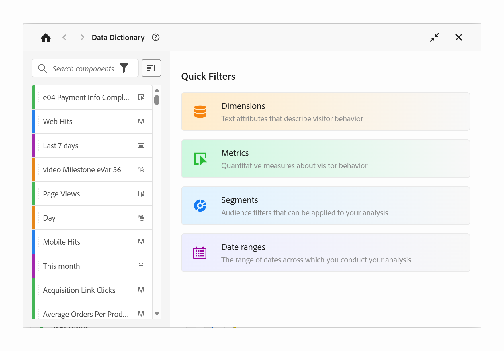
The reason this pays for itself is that a freeform table does not police what goes where. A segment can be dropped into a column and used as a dimension. A dimension can be dropped where a metric would normally sit. Those are legitimate techniques, and they are the reason a report built by somebody else can be genuinely hard to read at a glance.
Color is what rescues it. A person opening a project they have never seen does not need to inspect anything to know that the second column is a filter rather than a variable. It is blue. That single design decision does more for comprehension than any amount of documentation attached to the project, and it works on a screenshot pasted into an email, which is where most reports are actually read.
The report suite belongs to the panel, not to the project
This is the one setting that changes everything else on screen, and it is the one most often left at whatever it defaulted to.
Every panel carries its own report suite selector at the top right of its header, with the calendar beside it. Whatever is chosen there decides which components exist: the dimension list, the metric list, the segments, all of it is drawn from that suite. Change the selector and the rail redraws underneath you. Select a different panel and the rail redraws again, because it follows whichever panel is active rather than the project as a whole.
Both real report suites and virtual report suites appear in the same dropdown, and a virtual suite looks and behaves like any other suite once selected, which is exactly the point of one.
Because the setting sits on the panel, a single project can compare two properties, two regions or two brands side by side. That is precisely the thing a Dashboard in the old interface could not do at any price, and it is why a report that once needed two screens and a spreadsheet is now one scroll.
The same flexibility produces a specific confusion, and it catches experienced people. Two panels in one project can sit on different report suites, and nothing in the body of the report says so. A colleague scrolls from one panel to the next, sees visits fall by half, and reaches for an explanation about traffic. The explanation is a dropdown they did not look at. When numbers between two panels refuse to agree, check the report suite and the date range in both headers before investigating anything else.
Go and break something, because you cannot
The most useful advice for anybody with access to a real Adobe Analytics account is to open it and play. Combine things. Build a table nobody asked for. Break a dimension down by another dimension and see what falls out. Understanding tends to arrive after the outcome rather than before it, and no amount of reading substitutes for having built something and watched it behave.
That advice is usually given nervously, and the nervousness is misplaced.
There is no path from this screen back to the data. No button renames a variable, changes what a past hit contained, re-runs processing, or deletes a day of history. Reporting reads. Every destructive setting in Adobe Analytics lives in the admin tools, not here. A person exploring a freeform table cannot damage anything, and knowing that is what makes it possible to explore properly rather than tentatively.
There is a real risk, and it is a different one. Some things created inside a project are saved to the shared component library the moment they are created, not when the project is saved. Build a segment or a calculated metric inside a table and it appears in a list that every colleague on that report suite has to scroll past. Nobody has broken any data. They have added to a list that only ever grows, and an organization two years into this has hundreds of abandoned experiments in it, which is the subject of Curation and Templates.
Put a fixed marker at the front of anything created while learning, something like zz test AD, with initials in it. Everything sorts to the bottom of every list, it is obvious to a colleague that it is not for them, and clearing up later is one search and a multi-select rather than an archaeology exercise. Do not share any of it, and leave the tags and descriptions blank so nothing gets picked up by a curated view. This costs nothing at the moment of creation and is close to impossible to reconstruct three months later.
One caveat, and it is the only one. If the account carries administrator rights, the surrounding admin tools are reachable from the same login and those absolutely do change things permanently. The freedom described here belongs to Workspace. It does not extend to the menu above it.
Refusing nothing has a price, and it lands on the reader of the report rather than the data. A combination that makes no analytical sense still returns a number, formatted exactly like a good one, with a confident total at the bottom. The classic case is a prop broken down by a conversion metric: left alone, a prop does not survive the hit it was set on, so nearly every product shows zero orders and the confirmation page collects all the credit. Nothing on screen marks it as wrong. The fix is not to avoid the pairing but to tell the table how to attribute it, because an attribution model is recalculated at report time and will reach back through the visit for you. Freeform Tables covers how a table decides what it is counting, which is the knowledge that keeps this from happening to you.
Follow along: the first project, and the first thing to check in someone else's
Everything above is orientation. This is the part that turns it into muscle memory, and it takes about five minutes with a real account.
- Part one, build something
- Open
Analytics›Workspace›Create new project›Blank project. - In the panel header, top right, set the report suite. Do this before anything else. Everything in the rail is drawn from whatever is selected here.
- In the same panel header, set the date range. The calendar sits beside the report suite. Pick a month you know had traffic — a range with no data looks exactly like a broken report.
- Open the left rail ›
Components, the third icon down. Typedayin the search box and drag the orangeDaydimension into the empty table. -
Drag a green metric onto the table —
Page Views, orVisits. The table populates as it lands. That is a report. It took four steps. - Now drag a blue segment onto the same table. Watch it land as a column rather than replacing anything. Two columns, same rows, filtered and unfiltered.
- Part two, read something you did not build
- Open any project a colleague shared with you.
- Read the panel header first, not the numbers. Which report suite, which date range. Every figure below it means nothing until those two are known.
- Check the header of every panel, not just the first. Each one carries its own. They are frequently different, and that difference is rarely mentioned in the title.
- Look at the colour of every column before reading a value. Blue in a dimension position is a segment. Orange where a metric belongs is a breakdown.
There is nothing else to configure. Workspace has no setup step, no preferences to get right first, and no state to prepare. Access to a report suite is the entire prerequisite.
That is the minimum rather than the whole of it. Part one is the smallest complete thing this tool does, and part two is the habit that separates somebody who builds reports from somebody who can be handed one and trusted to say what it means.
A tool that refuses nothing
Analysis Workspace is a browser canvas where any dimension can be combined with any metric, arranged into panels that each own a report suite and a date range, out of a color coded rail of components that the rest of Adobe Analytics exists to fill. It is the survivor of two products, and it inherited the interaction model of the one built for analysts rather than the one built for report consumers, which is why it enforces almost nothing.
The thing worth carrying is that last clause, because it is the whole character of the tool. Reports & Analytics answered a narrow set of questions and refused the rest, and refusal is a kind of guidance. Workspace answers every question it is asked, including the ones that should not have been asked, and returns all of the answers in the same typeface. That is an enormous amount of power handed over on trust, and it only works in the hands of somebody who knows what a prop is, what a segment does to a number, and which report suite is under the panel.
Which is the argument for everything upstream of this screen, and the reason the rest of this module is worth the time. Projects and Panels takes apart the container that owns the report suite, the date range and the segments, because getting the panel right is most of getting the report right. Then Freeform Tables goes into the one component that does the real work, where rows, columns, breakdowns and attribution settings decide what the numbers in front of you actually mean.
Analytics > Workspace opens the Projects list, which is the landing page for every project in the login company. Create new project offers a blank project or one of Adobe's templates.
The report suite selector and the calendar sit side by side at the top right of each panel header, not in the project. The five rail icons, Panels, Visualizations, Components, Table of contents and Data dictionary, run down the far left edge of every project.
This article focuses on the concepts, architecture, and practical guidance behind the topic. For the latest UI walkthroughs and step-by-step implementation instructions, use the links below. They leave this site and open Adobe's own documentation in a new tab.