Analyze the data › Analysis Workspace
Cohort Analysis
A gym signs up four hundred people in January, which is a very good January, and the manager has the numbers to prove it. By the middle of February the floor is noticeably quieter, but the monthly report is still fine: new joiners are still arriving, total membership is holding, and revenue has not moved. In March it is quieter again, and the report says the same thing. Nobody is lying to anybody. Every number on the page is correct.
What the report cannot show is that almost none of the four hundred people from January are still coming. They stopped in the second week, quietly and individually, and the March arrivals are covering the gap they left behind. The total is doing what totals do, which is to add the people arriving and the people leaving into a single figure and then present it as though it described a stable situation.
Analytics has exactly this problem, constantly. Visits are up. Registered users are up. Everything looks like growth right up until somebody asks what happened to the people who registered last spring, and it turns out nobody has ever asked that question, because the reporting was not shaped to answer it.
Answering it needs a different arrangement entirely, and that arrangement is what a cohort table is.
A cohort is a group defined by when, not by who
Almost everything else in analytics separates people by attribute. Which channel they came from, which country they are in, which device they used, whether they bought anything. A segment is precisely that: a description of who somebody is, or of something they did, applied to whatever period you happen to be looking at.
A cohort groups people differently. It puts them together according to when they first did something, fixes that group, and then follows it forward through time regardless of anything else about them. Everybody whose first purchase was in week one is a cohort. Everybody whose first purchase was in week two is a different cohort, and those two groups are never mixed together again, no matter how similar the people in them are.
That single change is what makes a slow loss visible, and it is worth understanding why. A total is a snapshot, so arrivals and departures cancel each other out inside it and the result looks like stability. Follow one fixed group forward and there are no arrivals to hide behind. Whatever is left in week eight is what is left, and if that number is small then the number is small.
Two criteria, and confusing them is the standard mistake
Building one of these asks you for two things, and they sound similar enough that a great many people set both to the same value, get a table where the first column reads a hundred percent and the rest looks oddly healthy, and conclude that retention is fine.
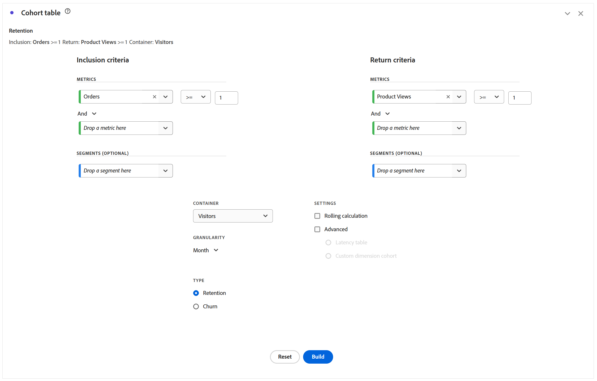
Inclusion criteria decides who gets into the cohort at all and when their clock starts running. Return criteria decides what counts as having come back. Those are genuinely different questions, and in most useful cohorts they are different actions: included by making a first purchase, returning by visiting at all. Set both to purchase and you have asked whether people who bought went on to buy again, which is a real question but a much narrower one than most people think they are asking.
Once the grid is built there are two ways to read it, and only one of them is a fair comparison. Reading across a row follows the life of one intake, showing how quickly that particular group fell away. Reading down a column compares different intakes at the same age, which is the comparison that actually means something. January's cohort at week three against February's cohort at week three is a real question about whether acquisition quality is changing. January at week eight against February at week two is not a comparison at all, and the triangular shape of the table invites people to make it constantly, because the eye is drawn along the longest row.
Three tables wearing the same grid
The table type changes what every cell measures without changing anything about how the grid looks, which is worth knowing before somebody hands you one and tells you what it proves.
| Type | What each cell says | Reach for it when |
|---|---|---|
| Retention | How many of the cohort met the return criteria in this period | The default question: did they stay |
| Churn | The inverse, how many did not return | The number has to land in a meeting. Sixty percent lost reads harder than forty percent kept |
| Latency | Time before and after the inclusion event, with inclusion in the middle | You want the run-up as well as the aftermath |
Latency is the one almost nobody opens and the one that most often changes a decision, because it puts the inclusion event at the center of the grid and shows the periods on both sides of it. That means it can answer what people were doing in the weeks before they converted, not only what they did afterward, and the run-up is the half of the journey that ordinary reporting throws away entirely.
Rolling calculation moves the denominator, and the numbers get better
There is a switch called rolling calculation, and it is the one setting in this visualization capable of turning a collapse into something that reads like an improving trend.
By default, every percentage in the grid is measured against the original cohort, so week three is a share of everybody who joined in week zero. Switch rolling calculation on and each period is measured against the period immediately before it instead. Both of those are legitimate calculations and they answer different questions: against the original cohort is survival, meaning how much of the intake is still here, while against the previous period is period-over-period retention, meaning that of the people who were still here last week, this many are still here now.
The second is almost always the higher number, because it quietly forgives everybody who already left.
Switch it on and every figure after the first column improves, because the denominator has shrunk to match the survivors rather than the intake. Nothing in the table announces which mode is active, both produce a perfectly plausible percentage in the same cell, and a cohort described as showing "sixty-eight percent retention at week four" means two completely different things under the two settings. The flattering reading is the one that tends to reach a deck, because it is the one somebody screenshotted while it was showing a good number. Whenever a retention figure is presented to you, ask what the denominator is before asking whether the number is good.
What the cohort table refuses to accept
This visualization is fussier about which metrics it will take than anything else in Workspace, and finding that out halfway through building something is a familiar and slightly infuriating experience.
It accepts only metrics it can use to filter people, which rules out several things you will reach for on instinct. Calculated metrics are refused, because they are evaluated after rows have been assembled and there is nothing left to test an individual person against. Revenue and other non-integer metrics are refused, because a cohort asks whether somebody did a thing rather than how much the thing was worth. Occurrences is refused for the same reason: it is not a filterable action.
The calculated metric exclusion is the one that stings, since the natural instinct is to build a cohort on conversion rate, and conversion rate is a ratio rather than something a person can be said to have done. The way through is always to reach for the underlying event instead, so not "converted at some rate" but "placed an order". Calculated Metrics covers why a formula cannot reach back to an individual, and the cohort table is one of the five places in the product where that boundary becomes visible.
Cohorts do not have to be about time
The default reading of a cohort is temporal, and it is easy to assume that is all there is, but a cohort can be built on a dimension instead. Everybody whose first visit came through paid search. Everybody whose first purchase was in a particular category. Everybody who started on mobile.
That turns the same grid into a considerably more useful instrument, because it stops asking how long people stay and starts asking which kind of first experience produces people who stay. Those are the same numbers pointed at an acquisition decision rather than a loyalty one, and the acquisition decision is usually the one somebody is about to spend real money on.
Build the same cohort table split by first acquisition channel and put the versions side by side. Retention curves by channel almost always diverge far more sharply than acquisition volumes do, and the channel that looks cheapest per visit turns out with some regularity to be the one whose people have all gone by week two. That single comparison moves a budget conversation from cost per acquisition to cost per acquisition that lasted, and it is unusually hard to argue with, because it follows named groups of real people forward rather than averaging anything.
Follow along: watch a total hide a collapse
The gym at the top of this section is much easier to believe once you have seen the same months read both ways in your own account, and the whole exercise takes about ten minutes.
- Part one, the report that hides it
-
Build a freeform table:
Monthin rows,Visitorsin columns. Six months if you have them. This is the reassuring view. Note whether the trend looks stable. - Part two, the cohort
- Drag
Visualizations›Cohort tableinto the same panel. -
Set the inclusion criteria to a first meaningful action.
Orders, or a signup event. Something that means arrival. -
Set the return criteria to something different —
Visits, or any engagement event. Setting this to the same metric as inclusion asks whether buyers bought, and the answer will look better than the business is. - Set
GranularitytoMonthlyandTable typetoRetention. - Read across one row, then down one column. Across is the life of one intake. Down compares intakes at the same age, which is the only fair comparison.
- Part three, the settings that change the story
-
Switch
Table typetoChurn. Identical data, and notice how differently it reads. - Switch rolling calculation on. Every figure improves. Nothing about the business did. Turn it off again and decide which one you would present.
- Change the cohort to a dimension instead of a date — first marketing channel, if you have it. Now the table is about acquisition quality rather than loyalty.
There is nothing else to configure. Inclusion, return, granularity, table type. Four choices, and the last two change the story more than most people expect.
Run it once and the rest follows on its own. Step 8 is worth doing once on real data, because watching your own numbers improve while nothing improves is considerably more persuasive than any warning about denominators.
The suspicion this teaches
A cohort groups people by when they first did something and follows that fixed group forward, which is the only arrangement in this product that makes a slow loss visible at all. Inclusion criteria starts the clock, return criteria decides what counts as coming back, and setting them to the same thing produces a table that flatters you. Retention, churn and latency are three readings of one grid, and latency is the one that shows the run-up. Rolling calculation quietly changes the denominator and improves every figure after the first.
What matters beyond retention reporting is the suspicion it teaches. Almost every reassuring number in analytics is a total, and almost every total is new arrivals covering for departures. Once you have watched a cohort table disagree with a healthy-looking trend line drawn from the same data, you stop trusting aggregates on their own, and that habit is worth considerably more than the visualization that produced it.
Cohorts answer whether people came back. They say nothing at all about what those people did while they were there, or about where the ones who left actually gave up. Fallout and Flow Analysis covers both of those: one tests a path you already believe in, and the other shows you the paths nobody thought to look for.
Analytics > Workspace, then the Visualizations icon in the left rail, and Cohort table. It can also be added from Insert in the menu bar.
Inclusion criteria, return criteria, granularity and table type all sit in the configuration panel that appears before the table is built. The gear on a finished cohort table reopens them, including Rolling calculation and the latency option.
This article focuses on the concepts, architecture, and practical guidance behind the topic. For the latest UI walkthroughs and step-by-step implementation instructions, use the links below. They leave this site and open Adobe's own documentation in a new tab.