Analyze the data › Analysis Workspace
Workspace Performance and Limits
There is a project in most companies that started life as one panel answering one question. Somebody added a second panel because a related question came up. A colleague asked for last year alongside this year, so a comparison went in. Somebody else needed the same view for a different region, and rather than build a new project it was easier to add a panel. A director wanted a summary at the top, so a summary panel arrived. Over eighteen months it accumulated the way a shared document accumulates, one entirely reasonable addition at a time.
It is now the most important project in the company, and it takes about ninety seconds to load.
Which means that the person who opens it in front of a room does so knowing they will be talking over a loading spinner, and that anybody who wanted to check one number decides not to bother. The analysis is good. The numbers are right. And the thing has become slightly too heavy to actually use, which is a failure mode nobody planned and nobody owns.
This section is about why that happens, what the real ceilings are, and what to do about it, because a report nobody waits for is a report nobody reads.
What a project is actually doing while you wait
The spinner is easy to read as one slow thing happening. It is not. Opening a project fires a large number of separate queries at Adobe, and the wait is the slowest of them plus the queueing of all the rest.
Every freeform table is at least one query. So is every anomaly detection band, because the statistics are computed rather than stored. So are the sparklines in a summary, the components listed in the left rail, and each of the visualizations that turned out to be reading a different table. A project that looks like eight panels can easily be fifty or sixty requests, and the browser is holding all of them in flight while the person watching decides whether they have time for this.
Which reframes the problem usefully. Making a project faster is almost never about one heavy table. It is about the number of separate things being asked for, and the two levers that matter most are how many queries there are and how much work each one requires.
The guardrails, and what they are actually telling you
Adobe publishes guidelines rather than hard walls for most of this, and the numbers are worth knowing because they are lower than people assume.
The guideline for total freeform table cells across a whole project, meaning rows multiplied by columns and then added up across every table, sits around four thousand. That sounds generous until you do the arithmetic: a single table showing two hundred rows against ten columns is two thousand on its own, and there are usually several tables. The guideline for panels in one project is around a hundred, which nobody hits deliberately and some projects reach by accretion. And the guidance on date range is that the longest range in a project should stay within about a year.
That last one carries a detail that catches people out. A year-over-year comparison does not fetch two ranges, it reaches across the whole span between them, so a comparison between this month and the same month last year is pulling against roughly thirteen months of data. Put three of those in one project and the date range guideline has been passed several times over without any single panel looking unreasonable.
A hard limit tells you when you have crossed it. A guideline lets you go past quietly, and the only symptom is that things get slower, which people attribute to the network, or to Adobe, or to the time of day. That is why projects degrade for months without anybody diagnosing them: nothing ever failed, so nothing was ever investigated. If a project has become noticeably slow, the useful assumption is that it has drifted past one of these numbers rather than that something is wrong with the platform.
Where the time actually goes, in rough order
Not everything costs the same, and knowing the order stops you optimizing the wrong thing. In practice the biggest wins come from the top of this list and almost nothing comes from the bottom.
| What costs time | Why | What to do about it |
|---|---|---|
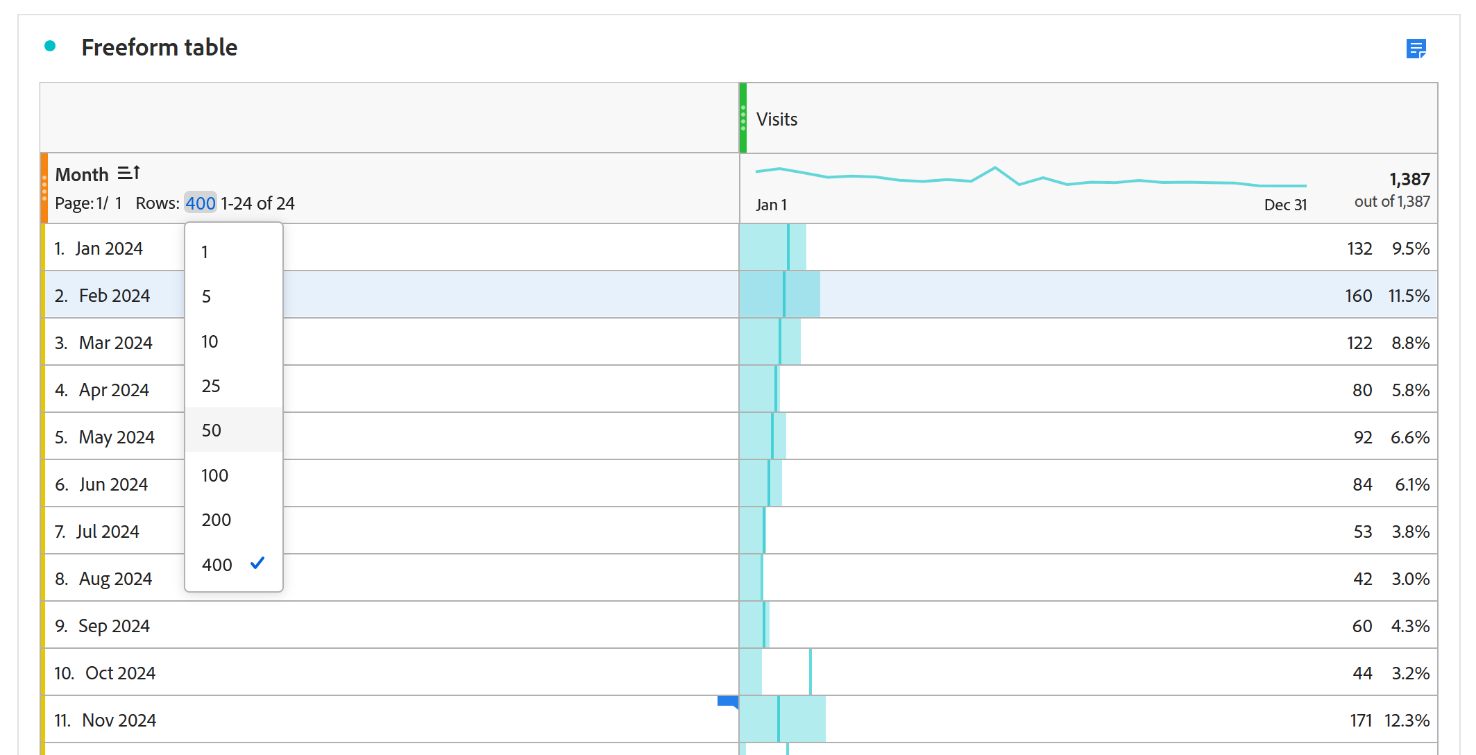
| Row counts nobody reads | A table set to show two hundred rows fetches two hundred rows whether or not anybody scrolls | Drop it to what is actually looked at, usually ten |
| Long and overlapping date ranges | Year-over-year spans the whole period between, not just the two ends | Shorten the range, and keep comparisons to the ones somebody uses |
| Too many panels in one project | Everything loads, including the panels nobody scrolls to | Split by audience into separate projects |
| Anomaly detection left on everywhere | Each band is computed at load, not stored | Keep it on the metrics somebody acts on |
| Expanded visualizations below the fold | They render on load even though nobody has scrolled | Collapse anything that is supporting rather than headline |
| Breakdowns left expanded | Each expanded branch is more rows fetched | Collapse them before saving |
| Flow visualizations | Reconstructing paths across hits is the heaviest query the product runs | Give flows their own project, or keep the panel collapsed |
Flow deserves singling out from that list, because it is in a different weight class from everything above it. Reconstructing what came before and after every hit, for every visitor, is genuinely expensive work, and one flow visualization can take longer to return than a whole panel of freeform tables. That does not make it something to avoid, since Fallout and Flow Analysis covers exactly why it is worth having. It does mean a flow rarely belongs in the middle of a project other people open every morning. Put it in its own project where somebody goes deliberately, or leave its panel collapsed so it is only computed when somebody actually wants it.
The pattern running through all of it is that Workspace fetches what the project asks for, not what the reader looks at. A table showing two hundred rows on a panel nobody scrolls to, with an expanded breakdown and an anomaly band, costs exactly as much as one somebody reads carefully. Most slow projects are slow because they are answering questions that were relevant eight months ago and have never been removed.
The fix that works better than any setting
All of the tuning above is real and worth doing, and none of it addresses the actual cause, which is that one project is trying to serve several different audiences at once.
Think about who opens the project from the opening of this section. A director wants three numbers and a direction. A channel manager wants their own channel in detail and does not care about the others. An analyst wants everything, including the working. Those are three genuinely different documents, and they have been merged into one because merging was easier than maintaining three, and because every individual addition was small.
Splitting them is the single most effective performance change available, and it is not really a performance change. Each audience gets a project that loads quickly because it is only holding what they need, each one is legible because nobody is scrolling past six panels that are not for them, and the analyst's version can stay as heavy as it likes because one person waiting thirty seconds while they think is a completely different situation from a director waiting thirty seconds in front of a room.
That also makes curation easier rather than harder, because a project built for one audience has an obvious answer to the question of which components belong in it.
Collapsed panels and collapsed visualizations do not render on load, which means a project can keep all of its supporting detail and still open quickly, as long as the detail arrives collapsed. Build the habit of saving a shared project in the state you want somebody to find it: headline panel open at the top, everything supporting collapsed underneath, breakdowns closed. It costs nothing, it survives being handed around, and it is the cheapest way to make a heavy project behave like a light one for the ninety percent of readers who only ever look at the top.
Follow along: take ninety seconds off a real project
This works best on a project that genuinely is slow, and the order matters, because the first three steps usually account for most of the improvement.
- Measure first
- Open the slow project and count, roughly: how many panels, how many tables, how many rows each table is set to show, and the longest date range in it.
- Multiply rows by columns across every table and add them up. Compare that against the four thousand cell guideline. Most slow projects are well past it.
- The three changes that do most of the work
- Row settings on every table: drop to what people actually read. Ten is usually enough. If somebody needs two hundred rows they need an export, not a table.
- Shorten the date range, and remove year-over-year comparisons nobody quotes. Remember each one reaches across the whole span between the two periods, not just the two ends.
- Collapse every panel and visualization that is not the headline. Then save it in that state, so recipients get it that way.
- Then the structural one
- List who opens this project and what each of them needs.
- If that list has more than one kind of reader on it, split it. Director version: three numbers and a direction. Team version: their own slice, in detail. Analyst version: everything, and it can stay slow.
- Curate each one, and share at the right level.
- Check
- Reopen the director version and time it. If it is not noticeably faster, go back to step 3, because the row counts are almost always the culprit.
There is nothing else to configure. Workspace has no performance settings. Every improvement available is a decision about asking for less.
That is a starting point rather than a finished method. Step 6 is the one that feels like organizational work rather than analytics work, and it is the one that permanently fixes the problem rather than deferring it for another eighteen months of accretion.
Ten ways to be confidently wrong
One uncomfortable fact sits under all of it: Analysis Workspace will answer almost any question you can express and will not tell you when the question was wrong. What follows is every silent failure this module names, gathered in one place, because they are far more useful together than scattered across the pages that introduced them.
None of these produces an error. Every one produces a number that looks exactly like a correct number.
| The mistake | What you get instead | |
|---|---|---|
| 1 | Reading a breakdown as a sequence | An intersection told as a journey. Order needs a flow, a fallout or a sequential segment |
| 2 | Quoting an indented figure as a site total | A number scoped to its parent row, presented as a claim about everything |
| 3 | Summing anything deduplicated | A spreadsheet total that will never match the table, and the table is right |
| 4 | A prop broken down by a conversion metric, no attribution model applied | Almost every value at zero and the confirmation page taking all the credit |
| 5 | Dynamic rows in anything scheduled or repeated | A comparison over time where the things being compared changed underneath it |
| 6 | A segment dropped on the wrong panel | Unfiltered totals that look entirely reasonable, beside filtered ones |
| 7 | Eventual Path on a funnel that is a designed sequence | A comfortably high number that forgives everybody who escaped and came back |
| 8 | Reading a flow with repeats switched on | A diagram about page reloads rather than about people |
| 9 | Presenting rolling calculation as retention | Percentages that climb while the population collapses |
| 10 | Treating an anomaly flag as a finding | A fortnight spent chasing ordinary variation, then a team that stops looking |
Two more are worth carrying even though they belong to the edges of the module. Inclusion and return criteria set to the same metric produces a cohort table that flatters you, and sharing by reflex hands somebody Edit original when Edit copy was what you meant.
Read down that list and a pattern appears that is more useful than any individual line. In every case the product did exactly what it was told, the number is arithmetically correct, and the mistake is in the question rather than in the answer. That is why none of them can be caught by checking the figure. They are caught by checking the arrangement that produced it, which takes about fifteen seconds and is the habit worth leaving this module with.
Where this module leaves you
A project is slow because of how many separate things it asks for, not because any one table is heavy. Rows fetched but never read, date ranges longer than anybody uses, comparisons that span thirteen months to show two, anomaly bands computed on metrics nobody acts on, panels that load for readers who never scroll to them. The published guidelines are guidelines rather than walls, which means a project passes them quietly and simply gets slower, and the real fix is usually structural: one project per audience, curated, shared at the level that matches what the reader is actually doing.
Step back from that and the whole module has been circling one idea. Analysis Workspace refuses almost nothing, and every one of the ten sections has been about a place where that freedom hands you a decision the product will not make for you. Which dimension goes at the top level of the table. Whether the funnel means eventually or immediately. Whether the retention percentage is measured against the intake or the survivors. Which of three roles the person receiving your work should get. How much a project is allowed to ask for. None of those have a default that is right in every case, and none of them announce themselves in the number that comes out.
That is the actual skill this module has been teaching, and it is not really about Workspace. It is that in a tool which will answer any question you can express, the quality of your answers is decided almost entirely by the quality of your questions, and by whether you know what you just asked for.
Analysis Workspace is where most people will spend most of their time, and it is not the whole of analyzing the data. Four more modules finish this phase, and each one exists because Workspace cannot do the job alone. Attribution Models takes apart the machinery behind that column setting from Freeform Tables, and decides which touch actually earns the credit. Activity Map answers the question no table can, which is where on the page people actually clicked. Data Warehouse is for the request that is too large or too raw for a report to hold. And Data Feeds hands you the hit-level data itself, one row per server call, for the work that has to happen outside Adobe entirely.
There is no performance screen. Everything in this section is changed in the places the settings already live: Row settings under a table's row header, the date range in each panel header, and the collapse control on every panel and visualization.
Anomaly detection is switched off in Column settings on the metric that carries it. Splitting a project is Project > Save as, followed by deleting the panels that do not belong to the audience you just built for.
This article focuses on the concepts, architecture, and practical guidance behind the topic. For the latest UI walkthroughs and step-by-step implementation instructions, use the links below. They leave this site and open Adobe's own documentation in a new tab.