Analyze the data › Analysis Workspace
Freeform Tables
Two people are looking at the same report and disagreeing about a number. One of them says Chrome accounts for eleven percent of traffic, the other has it at sixty-two percent, and both are reading a table they built themselves in the last ten minutes from the same report suite over the same dates. Neither has made a mistake, neither has misread anything, and the argument will run for a while before somebody works out what happened.
What happened is that one of them broke Page down by Browser, and the other broke Browser down by Page, and then both took a percentage from a row somewhere in the middle. The two tables contain overlapping data, they look nearly identical on screen, and they are answering completely different questions. Nothing about either report announces this.
That kind of disagreement is the everyday cost of the freeform table, which looks like the least interesting thing in Analysis Workspace. It is a grid. Rows down the side, numbers in the middle, and nothing about it that would survive a slide. It is also where every number in this product is decided, since the charts are drawings of it and the cohorts and funnels are specialized versions of it, and it deserves more attention than its appearance invites.
Rows ask what, columns ask how much
The grammar underneath is small enough to say in a sentence, and it is worth saying before anything gets complicated. A dimension in the rows names the things you want held apart from each other. A metric in the columns says how each of those things is being measured. Drop Page into the rows and Page Views into the columns, and what you have asked for is page views, separated out by page, which is exactly what appears.
Everything difficult about tables comes from what happens when that sentence gains a second clause.
What a breakdown really does
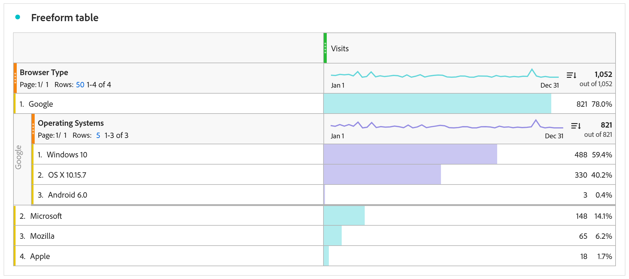
Take that table, right-click the product detail row, and break it down by Browser. Numbers appear underneath it, indented slightly, and the natural reading is that a second dimension has been added to the table and now you are looking at pages and browsers together.
That is not what happened. What you asked for is narrower and more specific: which browsers were used, among the page views of that one page. The breakdown is scoped inside the row above it, so it inherits that row as a condition, and the numbers underneath describe only the traffic that was already counted in the parent. They are not a list of browsers on the site, they will never sum to the browser totals, and they cannot be compared with a browser figure taken from anywhere else without a great deal of care.
All of which sounds pedantic right up until somebody screenshots the indented rows, drops them into a deck, and labels the slide "browser usage".
There is a second misreading, and it does more damage because it produces a story rather than a number. A breakdown says nothing whatsoever about order. Break Marketing Channel down by Page and you learn which pages were seen by traffic from that channel, not that the channel came first and the page came afterward. What you are looking at is an intersection, and an intersection has no direction in it at all. When the question is genuinely about sequence, the answer lives in Fallout and Flow Analysis or in a sequential segment, and no arrangement of a table will substitute for either.
Both of those tables are correct, and that is what makes the situation awkward. Neither is a better version of the other, neither contains an error, and the only visible difference between them is which dimension was dragged in first. A colleague handed the wrong one will read it perfectly fluently, quote a figure from it with complete confidence, and never encounter anything that suggests there was a choice made on their behalf.
A breakdown inherits every condition above it, including the parent row itself, so the numbers underneath a broken-down row describe that row and nothing wider. Copy one of them into a slide and it quietly becomes a claim about the whole site, which is a claim the table never made and cannot support. The only thing distinguishing the two on screen is an indentation, and an indentation survives neither a screenshot nor a paste into a spreadsheet nor somebody reading a figure out loud. If a number is going to travel beyond the person who built the table, take it from a table where that dimension sits at the top level rather than from a breakdown.
Selecting and dragging, which is where most of the speed lives
Everything above is about what a table means. This part is about how you actually operate one, and it matters more than it sounds, because the difference between somebody who slices data quickly and somebody who does not is mostly a handful of interactions that never appear in documentation.
Start with selection, because it changes what every other action does. Click a row and it is selected. Hold shift and click another and everything between the two is selected. Hold ctrl, or command on a Mac, and you pick individual rows that are nowhere near each other. That is ordinary enough, and the useful part is what selection then does to the next thing you do.
With several rows selected, breaking down applies to exactly those rows and nothing else. So if a page report has four hundred rows and five of them are the checkout funnel, select those five, break them down by browser, and you get browsers for those five pages only, rather than an unusable expansion of everything. The same selection can be right-clicked to create a segment containing precisely those items, which is the fastest route in the product from noticing something to isolating it. And dragging a component onto a selection behaves differently from dragging it onto the table as a whole, which is the source of a great deal of accidental restructuring.
The same idea reaches the panel. Select several segments in the left rail with shift or ctrl and drag them into the panel drop zone together, and instead of stacking them as a combined filter, Workspace builds a dropdown, so the reader can switch between them. That single behavior turns a project that would have needed five panels into one panel with a control on it, and almost nobody discovers it by accident. Dropping several date ranges in behaves the same way.
| Do this | And you get |
|---|---|
| Shift-click two rows | Everything between them selected |
| Ctrl-click or cmd-click rows | Scattered rows selected individually |
| Break down with rows selected | The breakdown applies to only those rows |
| Right-click a selection | A segment built from exactly those items |
| Drag several segments into the panel drop zone | A dropdown the reader can switch between |
| Drag a component onto a cell | It applies to that intersection only |
| Drag a component onto a column header | It applies to the whole column |
| Drag a dimension item rather than the dimension | A pinned row that will not change next month |
| Right-click a row > copy to clipboard | The values, without rebuilding anything in a spreadsheet |
None of those are tricks in the sense of being clever or optional. They are the difference between interrogating data and typing at it, and a person who knows six of them works several times faster than a person who knows none, on identical software.
Attribution lives in the column, and it overrules how a variable was built
Every column carries an attribution model whether or not anybody chose one, and the default is to credit a metric according to how the dimension behaves on its own. That is why a prop broken down by orders usually reports almost nothing useful: a prop holds its value for exactly one hit, so the only value that can receive credit for an order is whatever the prop happened to contain on the hit where the order fired, which on most sites is a confirmation page.
Open the column settings, apply an attribution model, and that stops being true, because the model is recalculated from the underlying hits at the moment the report runs rather than depending on what was stored at collection time.
Two consequences follow, and both are larger than a column setting has any business being. The first is that the distinction between props and eVars, which governs an enormous amount of implementation planning and occupies whole meetings, does not survive contact with an attribution model: applied at report time, a prop can carry any lookback window you choose, and an eVar's carefully configured allocation and expiration are simply set aside.
The second is that a decision everybody treats as permanent turns out to be provisional. An eVar's expiry gets chosen on the day it is implemented and lived with for years afterward, because changing it means changing collection. Here the same question is a dropdown, and two people can answer it differently over the same data on the same afternoon. What Is Attribution takes the models themselves apart.
Dynamic rows keep re-asking, static rows freeze the answer
This one is simpler than the words make it sound, and the whole difference is in what you dragged.
Drag the dimension and the rows are dynamic. You have asked for the top ten of something, so the table shows whatever is in the top ten today and whatever is in it next year. Drag one value from inside that dimension and the row is static. You have asked for that particular thing, and it reports that thing and nothing else.
Which matters mostly for projects that get saved and reopened later. A top ten products table built in March is showing September's products in September, with the same title, the same layout and nothing at all to mark the change, so anybody comparing it against last quarter's deck is comparing two different sets of products without knowing it. A pinned row cannot do that, and if its value disappears from the data the row shows zero, which is a finding somebody can act on rather than a silent substitution.
The rule that avoids most of this is short: dynamic rows while you are exploring, static rows for anything scheduled, shared or repeated. A project that goes to the same five people every month exists so they can see change over time, and change over time means nothing at all if the rows themselves change underneath the numbers. Pinning has a second benefit that matters during an incident, which is that it makes a disappearance visible: a static row dropping to zero is a finding somebody can act on, while a dynamic row quietly falling out of the top ten is not an event at all.
Percentages are honest about the number and quiet about the denominator
A percentage column looks like the least ambiguous thing available. It is a share, shares are simple, and nobody asks a follow-up question about a percentage in a meeting.
The question it never answers on screen is what it is a share of. Inside a breakdown, the percentage is of the parent row. At the top level, it is of the column total. Rearrange the table and the same visual percentage in the same position is suddenly measuring something else, while looking exactly as it did before. That compounds badly with everything in the breakdown section, because the most quotable figure in any table is a percentage sitting inside a breakdown, and that is precisely the one whose denominator is invisible.
| Setting | What it changes | Worth knowing |
|---|---|---|
| Row settings | How many rows to show, and a filter on which items appear | There is no static or dynamic switch in here. That is decided by whether you dragged the dimension or a value from inside it |
| Column settings | Attribution model, number format, percentages, conditional formatting | The one place attribution lives outside the Attribution panel |
| Column-level segments and dates | A column can carry its own segment and its own date range, narrower than the panel's | The only thing on screen saying so is a small icon in the column header. Hover every header before doubting a discrepancy |
| Percent shading | Only the visual heat, never the numbers | Shading is relative to visible rows, so paginating changes the colors |
| Totals | Whether the header total is the grand total or the sum of shown rows | These two disagree the moment a filter or row limit is in play |
The total row, and the row nobody looks at
Two rows sit at the edges of every table and both are misread often enough to be worth naming.
The first is the total. It is natural to read it as the sum of the rows above, and for most metrics that is exactly what it is. It is not what it is for anything deduplicated. Unique Visitors do not add up. One person who visited on Monday, Wednesday and Friday is one unique visitor for the week and appears in three daily rows, so a week of daily uniques summed by hand comes out considerably higher than the weekly figure the table itself reports. The same holds across dimension rows: somebody who used two browsers is counted once in each row and once in the total. Neither number is wrong, and anybody adding a column of them in a spreadsheet will produce something that is.
The second is the row most people scroll past. Unspecified, sometimes shown as None, is what appears when a hit was counted but the dimension had no value on it. The reflex is to treat it as noise and exclude it, and the row settings will happily let you. That reflex hides the finding. A large Unspecified against a variable that is supposed to be populated everywhere is not an untidy row, it is a report telling you the implementation is not doing what the specification says, which is exactly the sort of thing this screen exists to surface. Look at it before you decide whether to hide it, and if it is large, go and find out why rather than tidying it away.
This is the most common way a spreadsheet disagrees with Adobe Analytics, and the disagreement usually gets blamed on the tool. Deduplicated metrics cannot be reassembled from smaller pieces: monthly uniques are not the sum of the weeks, weekly uniques are not the sum of the days, and the total of a broken-down column is not the sum of its children. If a number has to be added up outside Workspace, use a metric that actually sums, such as Visits or Occurrences, and leave the deduplicated ones to be read where they are calculated.
Follow along: build one table four ways and watch the meaning move
This is the exercise that makes the rest of the section permanent, and it takes about five minutes. The numbers are not the point. What you are watching for is how little has to change before a number means something else.
Before you start: a blank panel, a report suite with data, and a month that has some.
- Arrangement one, the plain question
-
Set
RowstoBrowser, andColumnstoPage Views. Note the number against the top browser. Write it down. - Arrangement two, the breakdown
-
Right-click the top browser row ›
Break down›Day. The indented numbers now sum to that browser's total, not to the site's daily totals. Same data, narrower question, no visible warning. - Arrangement three, the swap
-
Start a new table. Set
RowstoDay, then break the top day down byBrowser. Find the cell that matches step 2. It is the only figure the two tables share. Everything around it has changed. - Arrangement four, pinned
-
Expand the
Browserdimension in the left rail and drag one specific browser into the rows. That row is static now. It will report that browser next year, or report zero, and will never quietly become a different browser. - Working it
- Shift-click three rows, then break those three down. Only the selection expands. Try the same with ctrl-click on rows that are far apart.
-
Select several rows › right-click ›
Create a segment. You now have exactly those items isolated, in seconds. - Shift-select two segments in the rail and drag both onto the panel drop zone. A dropdown appears rather than a stacked filter.
- The column setting
-
Open
Column settingson a conversion metric ›Attribution›First touch. If the row dimension is a prop, watch the numbers move. Nothing was recollected. The model was recalculated.
There is nothing else to configure. Every table in this product is these few settings in some combination.
Work through it once and the rest of this section stops being theory. Steps 3 and 4 together are the pair worth repeating until the difference is instant, because that is the difference between reading a table and operating one, and steps 6 to 8 are where most of the speed lives.
Read the arrangement before the number
A freeform table is a question written in two directions, with rows naming what is held apart and columns saying how it is measured, and every cell answering both at once. A breakdown does not widen that question, it nests a narrower one inside a row and inherits everything above it, which is why indented figures never sum to a site total. Rows are dynamic and will change under you unless you pin them. Attribution lives in the column settings and quietly overrides how a variable was ever configured to behave. And the selection behaviors are not shortcuts, they are how the tool is actually used.
What comes out of all of that is one habit, and it is small enough to carry everywhere: before reading any number, read the arrangement that produced it. Which dimension is at the top level, what is indented underneath what, whether the rows are pinned, what the percentage is a percentage of. Those four things decide the meaning of every figure on the screen, and not one of them is visible in the figure itself.
It also explains why the charts in this product are less independent than they look. Every visualization is drawn from a table exactly like this one, inherits its arrangement without comment, and repeats whatever that arrangement decided, with no indentation left to warn anybody. Visualizations covers what happens when a number becomes a picture, and why the picture is never the analysis.
A freeform table is the default content of any new panel in Analytics > Workspace, and it is also the first entry under the Visualizations icon in the left rail.
Right-click a row for Break down, segment creation and the copy options. The gear beside a column opens Column settings, where attribution, number format and percentages live. Row settings sit under the row header, and that is where the row count and the static or dynamic choice are made.
This article focuses on the concepts, architecture, and practical guidance behind the topic. For the latest UI walkthroughs and step-by-step implementation instructions, use the links below. They leave this site and open Adobe's own documentation in a new tab.