Analyze the data › Attribution Models
Attribution Models Compared
An agency emails to ask why their channel is down 40% in the report you sent on Friday. Their spend has not changed.
You check the date range. Same. The report suite. Same. The segment. Same. The data has not been reprocessed, because the quarter closed three weeks ago. Eventually you find the difference: Friday's version was rebuilt by a colleague who left the attribution model on the default, and the earlier one was on first touch. The agency's performance did not move at all. A drop-down created and destroyed 40% of their apparent contribution.
This happens because Adobe gives you eleven rules for splitting the same number, and most companies have never agreed which one they use. Knowing what each rule does is how you have that conversation properly.
Eleven models, but only three shapes
The list of models is long enough to look like eleven slightly different flavours, and it is hard to hold in your head that way. It gets much easier once you see that they are really three shapes.
The first shape gives the whole sale to one touch point and nothing to the others. Last touch, first touch and same touch all do this. They differ only in which touch point they pick.
The second shape takes one sale and cuts it into pieces that add back up to one sale. Linear cuts evenly. U-shaped and the two J curves cut by position. Time decay cuts by how recent each touch was. Custom cuts by weights you type in.
The third shape does not cut anything. Participation gives the whole sale to every touch point that appeared. Five channels in one journey produce five whole sales in the report. The column is not a share of anything.
Remembering the three shapes is worth more than memorising eleven names, because the shape decides whether a model can answer your question.
If the number will be used to split a budget, you need a shape whose pieces add up to one sale, or your percentages will not add up to 100 either. If you want to know which channels a buyer saw at any point, you need the third shape. The other two will give you a confident answer to a question you did not ask.
Every model and the exact split it uses
With the shapes in place, the full list is something to look up rather than learn. The splits below are exact. The third column is the question each model is really built for, which is usually narrower than how people use it.
| Model | The split, exactly | The question it answers |
|---|---|---|
| Last Touch | 100% to the most recent touch point. This is the default when no model is chosen. | What was in front of them when they bought? |
| First Touch | 100% to the earliest touch point inside the window. | What brought them in? |
| Same Touch | 100% only if the touch point is on the same hit as the sale. Otherwise nothing gets credit. | What converted them on the spot? |
| Linear | Equal shares to every touch point. | Who was involved, and how often? |
| Participation | 100% to every touch point. Repeats are counted once. Totals are meant to exceed the real sales count. | Which channels appeared at all? |
| U-Shaped | 40% first, 40% last, the other 20% shared by the middle. | Who found them and who closed them? |
| J-Curve | 60% last, 20% first, the other 20% shared by the middle. | Same, but closing counts for more. |
| Inverse J | 60% first, 20% last, the other 20% shared by the middle. | Same, but finding counts for more. |
| Time Decay | Older touches count for less, on a curve. You set the half-life. Default is 7 days. | How fast should a touch fade as it ages? |
| Custom | Weights you choose for first, middle and last. Adobe scales them to 100% whatever you type. | What does this business actually believe? |
| Algorithmic | Worked out from the data instead of by a fixed rule, using the Harsanyi Dividend. Adds up to 100%. | What does the data suggest on its own? |
Two of those are worth a second look. Same touch seems pointless until you need it. It is the only model that refuses to credit a journey, so it is the honest choice for impulse purchases. It also tells you how much of your volume involved no earlier touch at all.
Custom is not an escape hatch for people who dislike the other ten. It is how you write down a belief the business already holds. If your marketing director thinks the opener is worth roughly twice the closer, custom is where that goes.
Two rules that cancel the model you picked
This changes how you read every attributed report, and it is barely mentioned anywhere.
A model only has work to do when there is more than one touch point to split between. If a sale has one touch point inside the window, that touch point gets 100% of it and your model makes no difference at all. First touch, last touch, U-shaped, algorithmic: same answer every time.
If a sale has two touch points, the position-based models have no middle to give the middle share to, so they fall back to simpler splits. U-shaped becomes 50 and 50. J-curve becomes 75 to the last and 25 to the first. Inverse J is the same the other way round.
Now think about what that means in a real report. Most dimensions have a long tail of rows with a handful of sales each, and many of those sales had a single touch point. So on a large share of the rows in front of you, the model named in the column header is doing nothing, and the number would be the same under any of the eleven. The movement you see when you switch models comes almost entirely from the top few rows, where journeys are long enough for the split to matter.
Somebody builds a first touch and a last touch column, sees almost no difference, and decides attribution does not matter for this business. Usually they have found something else: most sales in that report have one touch point inside the window. That is worth knowing, but it is a fact about journey length or about a window set too short, not a fact about models. Widen the window and run the comparison again. If the columns separate, the old window was hiding the journey. If they still agree at 90 days, your customers really do buy on a single touch, and the marketing team should hear that.
Participation asks a different question
Participation sits in the same drop-down as the others and behaves nothing like them. That mismatch breaks more reports than the rest of the list put together.
Under every other model, one sale produces one sale's worth of credit spread across the table. Under participation, one sale produces as many sales' worth of credit as there were touch points, because each one gets the whole thing. A journey through four channels adds four orders to a report describing one real order.
That is not a bug to work around. It is the definition. Participation answers "which channels appeared in journeys that ended in a sale", not "who deserves the credit", and no other model can answer it.
Participation totals are bigger than your real sales count, so any calculated metric using one as a denominator gives you a rate that is quietly wrong. Use one as a numerator against a normal denominator and you can get a conversion rate above 100%. Nothing warns you. The metric builds, the column renders, and the percentage sits there looking like a percentage. The same goes for putting a participation number on a slide next to a revenue total, where the two look comparable and are not. Use participation for ranking and overlap, and keep it out of every ratio.
Time decay and custom need a number from you
Two models ask you to supply a number, and almost nobody changes either default.
Time decay gives more credit to recent touches and less to older ones, then scales the result so the pieces still add up to one sale. How fast the credit drops off is set by the half-life, which is the time it takes for a touch to be worth half as much. Adobe ships it at 7 days.
Seven days is not right for any particular business. If your customers decide in an afternoon, a 7 day half-life treats a three day old touch as almost fresh, so the model is not really punishing age at all. If your customers take two months, anything older than a fortnight is worth almost nothing, so the closing channels take everything and you get last touch in disguise. Set the half-life from your real buying cycle, which is measured in Lookback Windows.
Custom lets you type the weights for first, middle and last yourself, and the numbers do not have to add up to anything. Type 5, 1 and 4 and Adobe turns that into 50%, 10% and 40%. So you can hold the conversation in whatever units the business thinks in, including a plain ratio like "the opener is worth about twice the closer", and convert afterwards.
Algorithmic, and when not to use it
Algorithmic is the only model that does not impose a shape. Instead of applying a fixed rule, it works out each touch point's contribution from the journeys in your data, using something called the Harsanyi Dividend.
That comes from game theory, and it is a general version of the Shapley value, which won Lloyd Shapley a Nobel Prize in economics. The problem it was built for is this one: several people work together to produce a result, they contribute different amounts, and the reward has to be divided in a way everyone accepts. Attribution turns out to be a version of a problem economists had already spent decades on, which tells you it is genuinely hard rather than a matter of taste.
It is the strongest model in the list and it is still not the safe default. Three reasons, all easy to check first.
It only differs from the other models when journeys have several touch points, so on a report full of single touch sales it agrees with everything else. It cannot run against summary-level data sources, because those have no visitor ID and therefore no journey. And its output cannot be explained by quoting a rule. When a stakeholder asks why their channel moved, the honest answer is that the data implied it, which is a hard thing to defend in a meeting.
Compare two models and read the gap
When people meet eleven models, they usually try to work out which one is right, adopt it, and stop thinking about the rest. It is more useful to treat any single model as one view and to read the gap between two of them as the result.
A channel with far more first touch orders than last touch orders is an opener. Its job is finding people who did not know you, and judging it on closing will get it cut. A channel with far more last touch than first touch is a closer, which is what email and retargeting nearly always turn out to be. Asking it to prove it acquires customers will get it cut just as unfairly.
Neither of those facts shows up in one column. Both are obvious the moment the two sit side by side.
The same trick works elsewhere. Participation against linear separates channels that turn up everywhere from channels that turn up rarely and matter when they do. A short window against a long one separates fast sales from slow ones. In each case the useful number is the difference, and a report showing only one model has thrown that away.
Follow along: build the comparison
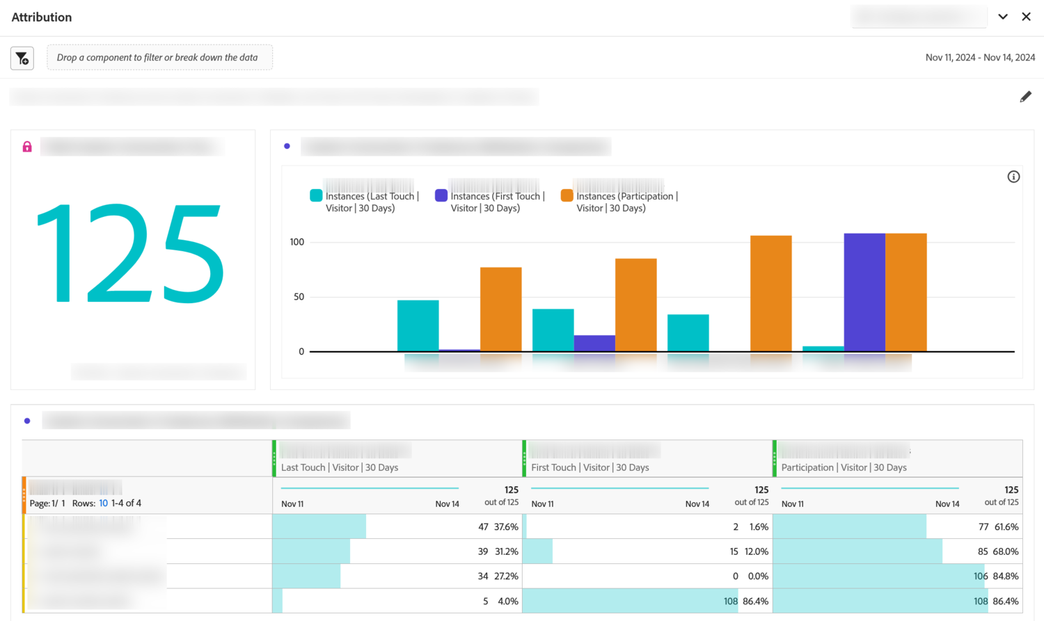
Adobe has a panel that does the whole comparison for you, and most people who use attribution every day have never opened it. Both approaches are worth knowing: the panel for exploring, the table for the report you actually send out.
- Part one, explore with the panel
-
In a Workspace project, drag
Panels›Attributiononto an empty area. -
Drop in a success metric and a dimension.
OrdersandMarketing Channelwill do. Any dimension works here. Internal search term or product category will be more interesting. -
Pick three models rather than one:
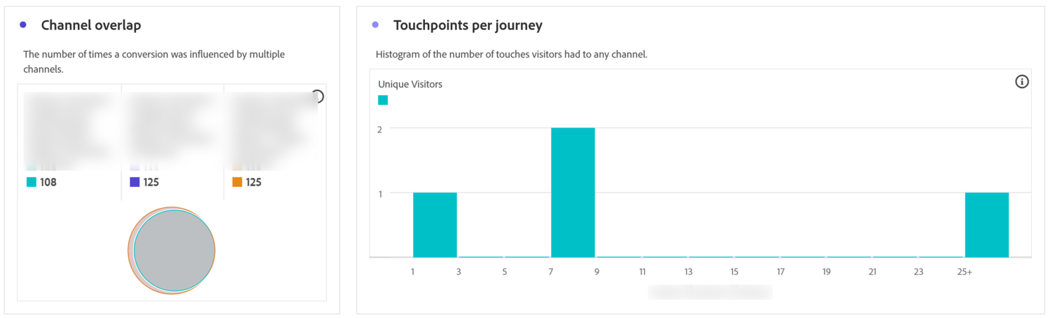
First Touch,Last TouchandParticipation. Set the container toVisitorand the window to90 days, thenBuild. Three is the useful number. Two shows you a gap. Three shows whether the gap is about position or about presence. - Look at the overlap diagram before the bar chart. It shows which channels appear together in the same journeys. No ranked list can tell you that.
- Part two, keep what you found
- Build a plain freeform table underneath, with the same dimension in rows and the metric in columns, duplicated twice.
- Set the three columns to first touch, last touch and participation, using the same window, and rename each header to carry its model. The panel is for you. This table is for whoever opens the project next.
- Add a fourth column as a calculated metric: first touch orders minus last touch orders. Positive rows are openers, negative rows are closers. This column usually settles more arguments than the rest of the table.
There is nothing else to set up. The panel builds its own charts and cannot be edited afterwards, so treat it as a place to explore and rebuild it when you want something different. The table beside it is the version that lasts.
Three shapes, and two rules underneath them
Eleven models come down to three shapes. One gives the sale to a single touch point. One cuts the sale into pieces that add back up to one. Participation gives the whole sale to everybody, so it is not a split at all and must never go into a ratio.
Within the cutting shape the differences are about position. Two models ask you for a number, and the 7 day half-life on time decay is the one most worth changing. Algorithmic works the split out from your data instead of imposing it, which makes it the most defensible and the hardest to explain.
Underneath all of them are two rules that decide more of your report than the model does. One touch point takes everything whatever you picked, and two touch points fall back to simpler splits. So if a comparison shows almost no movement, that is usually telling you how long your journeys are, and a different model will not fix it.
Which leaves the setting that has been deciding what counts as a touch point in every example here. A sale can only be split among the touch points the model can see, and how far back it may look is a separate choice from the model. Get it wrong and a well chosen model reports on a journey it can barely see. Lookback Windows covers what the window does, why it is not the same as your report's date range, and how to measure the right one.
Analytics > Workspace. The full model list appears in three places: Column settings on a metric column in a freeform table, the metric settings inside the calculated metric builder, and the Attribution panel, which is the only one that shows several models at once.
Add the Attribution panel from the Panels icon in the left rail. Its charts are generated when you press Build and cannot be changed afterwards, so rebuild rather than edit.
This article focuses on the concepts, architecture, and practical guidance behind the topic. For the latest UI walkthroughs and step-by-step implementation instructions, use the links below. They leave this site and open Adobe's own documentation in a new tab.