Analyze the data › Analysis Workspace
Anomaly Detection and Contribution Analysis
Somebody in every analytics team has the morning job. They open a project at nine, run their eye down a column of numbers, and look for anything that seems wrong. Most days nothing does, so they close it and get on with the actual work. It takes four minutes and it feels responsible.
The trouble is what that job is really asking a person to do. To spot something unusual you have to know what usual looks like, and usual is not one number. Orders on a Tuesday are not orders on a Saturday. December is not February. A campaign that ended last week moved the baseline and nobody wrote it down. So the person doing the morning check is quietly holding a mental model of normal for every metric they look at, and that model is built from memory, and memory is generous about numbers that were fine and vague about numbers that were not.
Then there is the arithmetic of the thing. A serious report suite has a few hundred metric and dimension combinations that somebody would care about, and no team checks a few hundred of anything every morning. They check the six they always check, which means every problem that happens somewhere else waits until it is large enough to be noticed by accident, and by then it has usually been happening for a fortnight.
Anomaly detection exists because that job should not belong to a person's memory at nine in the morning.
What the product is actually doing when it draws that band
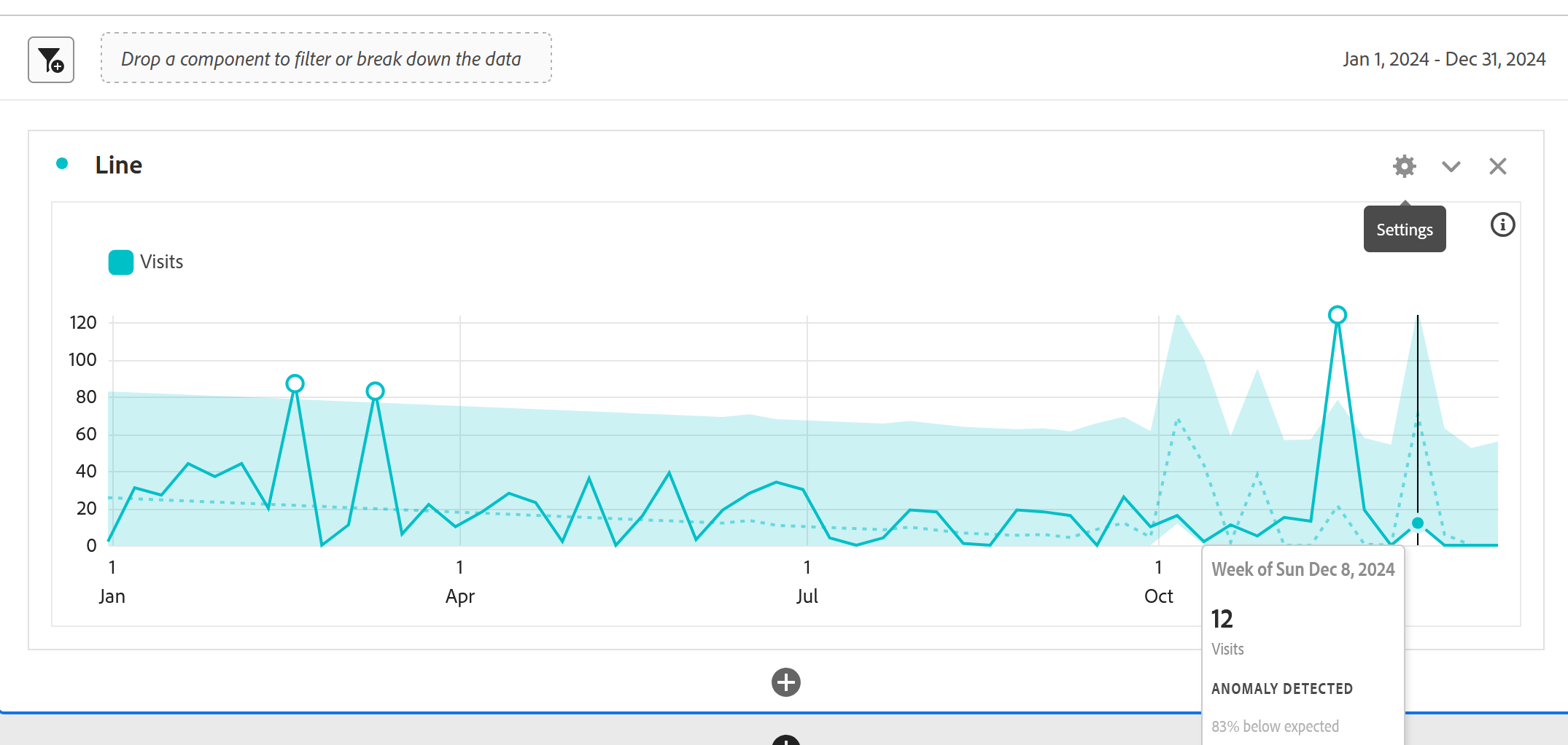
Turn anomaly detection on and a line chart gains a shaded band around it, with the occasional dot sitting outside. The band is the range the product expected, the dot is a value that fell outside that range, and the whole thing looks reassuringly like the software knows something.
It is worth understanding how that band gets drawn, because the answer explains most of what anomaly detection is good and bad at. Adobe looks backward over a training window, works out what the metric normally does including its weekly rhythm and its trend, projects that forward, and draws the range where the next value should land if nothing has changed. A point outside the range is not being called wrong or important. It is being called surprising given the recent past, which is a narrower claim than most people hear.
The training window varies with the granularity you are looking at, and the differences matter more than they sound. A daily view learns from roughly the last thirty-five days plus the same period a year ago, so it knows about last month and about last Christmas. A weekly view learns from about fifteen weeks plus the same range last year, and a monthly view from about fifteen months on the same basis. Hourly works from the last few hundred hours. The technique underneath changes too: daily granularity uses a time-series model that accounts for error, trend and seasonality, while weekly and monthly switch to an outlier test that asks how extreme a value is against the spread of the others rather than trying to forecast it.
Two things follow from that, and both are worth carrying. The first is that the band is not a judgment about whether a number is good. A metric can be alarmingly low and entirely unsurprising, because it has been alarmingly low for a month and the model has learned to expect it. The second is that the model only knows what is in the data. It has no idea that marketing paused a campaign, that a release shipped on Thursday, or that a tracking change went live and broke a variable, so a perfectly explainable event and a genuine problem arrive on the screen looking exactly the same.
The flagged dot means one thing only: this value is unusual against the recent past. It does not mean something broke, it does not mean anybody should act, and on a metric with genuine volatility a handful of points will fall outside the band in any given month simply because that is what statistical ranges do. Teams that treat every flag as an incident spend a fortnight chasing normal variation and then quietly stop looking, which leaves them worse off than before, because now there is a monitoring system everybody has been trained to dismiss. Read a flag as a prompt to go and look, never as a conclusion that has already been reached.
So what do you do with a dot
Somebody hands you an anomaly and the useful sequence is short, and it is worth having before you need it, because the alternative is opening twelve tables in a slightly panicked order.
Start by asking whether the data arrived at all, since a collection failure and a business event look identical in a report and only one of them is worth a meeting. Then check whether the whole metric moved or one slice of it, because a site-wide drop and a single-channel drop have completely different causes. Then check whether anything shipped, which is the question the model cannot ask and a person can answer in thirty seconds by looking at a release calendar. Only after those three is it worth building anything.
Contribution analysis is the tool that shortens the second of those questions, and it is the piece of this feature most people never use.
Contribution analysis, and what it is really for
Run contribution analysis against a daily anomaly and Adobe goes through the dimensions available in that report suite, looks at how each value behaved on the anomalous day compared with how it normally behaves, and reports the ones that moved most. The output arrives as a set of dimension items ranked by how much they appear to have contributed, with segments generated for the top few so you can drop them straight into a panel and carry on.
The value is not that it thinks. It does not. What it does is search, and it searches a space you would never search by hand: every value of every available dimension, all at once, in the time it takes to fetch a coffee. When a drop turns out to be one browser version on one operating system in one country, a person will eventually find that by breaking the data apart for an hour, and contribution analysis will hand it over before the hour starts.
What it will not do is tell you why. It reports that Safari 17 on iOS accounted for most of the movement, which is a fact and not an explanation, and the explanation still requires somebody who knows that the release last Thursday touched the checkout script. That gap between correlation and cause is permanent, and the feature is honest about it, but the ranked list is persuasive enough that people forget.
Access depends on the package a company bought, and the number of analyses available per month can be limited rather than unlimited. That is worth checking before building a workflow around it or promising it to a team, because discovering the limit halfway through an incident is an unpleasant way to learn. Anomaly detection itself is broadly available; it is specifically the contribution step that carries the entitlement question.
Where it earns its place, and where it does not
Anomaly detection is at its best on metrics that are high volume, reasonably stable, and genuinely important, which describes a surprisingly small set. Orders, revenue, visits, a few conversion events. Those have enough data every day for the model to know what normal looks like, and enough consequence that an unusual day is worth somebody's attention.
It is close to useless on metrics that are small, spiky, or seasonal in ways the training window cannot see. A form submission that happens forty times a day will flag constantly, because forty is a number where ordinary randomness looks dramatic in percentage terms. A metric driven entirely by campaign activity will flag every time a campaign starts and stops, correctly and uselessly. And anything with an annual rhythm the window does not cover will be surprised by the same event every year.
The judgment, then, is not whether to switch it on. It is what to point it at, and the honest answer is fewer things than the feature invites. A handful of metrics that somebody would genuinely act on, checked automatically, beats a wall of flags that trains a team to look away.
The half that actually changes behavior
Everything so far has one thing wrong with it, and it is not statistical. Anomaly detection inside a project only helps somebody who opened the project, which puts it in exactly the same position as the morning check it was supposed to replace. If nobody has time on Tuesday, Tuesday goes unwatched.
The version that fixes that is an intelligent alert, and it runs on the same statistics. Rather than drawing a band in a report you have to open, it watches a metric continuously and sends an email or a text when the metric moves outside its expected range. The morning ritual stops depending on anybody having time, and the four minutes at nine o'clock become four minutes on the days something actually happened.
An alert asks for three things. Which metric to watch, at what granularity, and how far outside normal something has to go before you hear about it. That last one is where alerts succeed or fail, and it is why the calibration exercise earlier in this section matters: you set the threshold from what you learned about how noisy that metric really is, rather than from a number that sounded reasonable. A metric that flags six times in ninety days inside a project will send six emails, and after the third one somebody sets up a mail rule.
Alerts can also be stacked, so one alert watches for a small movement and another for a large one, which lets you separate the thing worth glancing at from the thing worth interrupting somebody about. And because they are built on the same anomaly model rather than on a fixed number, they already understand that Sunday is not Wednesday, which is the reason a hand-written "tell me if orders drop below 500" rule fires every weekend and gets switched off within a month.
The order matters more than it sounds. Put the metric in a project with anomaly detection switched on, look at ninety days of it, and count how often it steps outside the band on its own. That count is your noise floor, and it tells you where the alert threshold has to sit to be worth having. Teams that skip this step guess a threshold, get flooded, and conclude that alerting does not work for their business, when what actually happened is that they pointed a sensitive instrument at a volatile metric and never checked how volatile it was.
Follow along: find out how noisy your own metrics are
The most useful thing you can do with this feature on a first pass is not to hunt for a problem. It is to learn which of your metrics are quiet enough for the statistics to be worth anything, because that tells you what to monitor and what to leave alone.
- Part one, turn it on
-
Build a freeform table:
Dayin rows, a high volume metric in columns. Ninety days or so, enough for the model to have learned. - Add a
Linevisualization underneath it. - Open column settings on the metric and enable anomaly detection. The band appears. Count the flagged points.
- Part two, calibrate
- Repeat with a small metric — something under a hundred a day. Count the flags again. It will be a lot more, and none of them will mean anything. That contrast is the lesson.
- Repeat with a campaign-driven metric. Watch it flag every start and stop, correctly and uselessly. This is what “the model cannot see your calendar” looks like in practice.
- Part three, investigate one
- Pick a real flagged day on a metric that matters.
- Ask, in this order: did the data arrive at all? Did everything move, or one slice of it? Did anything ship that day?
- Right-click the anomaly and run contribution analysis, then read the ranked dimension items. Note that it tells you where the movement was and never why.
- Take the generated segment into a new panel and go and find the why yourself.
There is nothing else to configure. The statistics have no settings worth arguing with. The judgment is entirely in what you point them at and what you do with a flag.
None of that is exhaustive, and it does not need to be. Step 4 is the one worth doing on your own data, because a small metric flagging six times in ninety days is the single fastest way to understand why teams stop trusting automated monitoring.
Calibrate it before you trust it
Anomaly detection builds a picture of what a metric normally does, using a training window that already understands weekends, seasonality and trend, and flags the points that fall outside it. The technique changes with granularity, the window changes with it, and none of it knows anything about releases, campaigns or tracking changes, which means a flag is always a prompt to look and never a conclusion. Contribution analysis takes a daily anomaly and searches every dimension at once to say where the movement came from, which is a genuine time saving and still stops one step short of why.
The habit worth taking is the calibration rather than the feature. Point it at a few metrics that matter, learn how noisy each of them really is, and set expectations from that rather than from the assumption that a flag means something is broken. A monitoring system a team believes is worth more than one that is technically more sensitive, because the second one gets ignored within a month.
All of which assumes somebody is opening the project. By this point in the module a project can hold panels on several report suites, freeform tables with breakdowns nobody else can interpret, cohorts, funnels, and a statistical band that needs a paragraph of explanation, and it is entirely legible to the person who built it. Curation and Templates deals with what happens when that project has to be handed to somebody else.
Anomaly detection is switched on per column, inside Column settings on a freeform table, and it appears visually on a Line visualization drawn from that table. The date granularity of the table decides which statistical technique is used.
Right-click a flagged point to run Contribution analysis, which opens in its own panel with the top contributing dimension items and generated segments. Continuous monitoring lives outside a project, under Analytics > Components > Alerts.
This article focuses on the concepts, architecture, and practical guidance behind the topic. For the latest UI walkthroughs and step-by-step implementation instructions, use the links below. They leave this site and open Adobe's own documentation in a new tab.