Analyze the data › Analysis Workspace
Visualizations
An analyst spends a morning on a real piece of work. Mobile conversion has fallen and nobody knows why, so they break the data apart for an hour and eventually find it: the drop sits in one step of the checkout, on one operating system, and only since the release two weeks ago. The freeform table on the screen holds every part of that. It is correct, every number in it can be defended, and it took genuine skill to build.
Then they carry it into the eleven o'clock meeting. Somebody asks about the second row. Somebody else is reading the wrong column and arguing with a number that is not there. The product manager, who is the one person in the room who actually has to decide whether to roll the release back, looks at forty numbers in a grid and says he will take it away and read it properly afterward, which everybody present understands to mean never.
The following week the same analyst brings one line chart with two lines on it and a single sentence underneath. The decision takes about ninety seconds.
Nothing about the analysis changed in between. The table was right the first time, and the chart the second time was drawn from that same table without one number being recalculated. What changed is that the finding had been given a shape a person can absorb while half-listening, and turning an answer into that shape is a genuinely different job from finding the answer. That second job is what this part of Workspace is for.
Why the chart arrives already filled in
Drag a line chart into a panel and something slightly odd happens: it appears with your data already in it. You did not choose a dimension, you did not choose a metric, and yet there it is, plotting the right thing.
That is not cleverness on Adobe's part, and it is worth knowing what actually happened, because everything else in this section follows from it. The chart looked around, found the nearest freeform table, and started drawing that table's numbers. It has no data of its own, it never asked for any, and if you deleted the table it would have nothing to show. A visualization in Workspace is a rendering, and the table underneath is the thing being rendered.
Most of the time this arrangement is a gift, and it is worth being clear about why. It means a chart can never drift out of step with the analysis behind it, the way a number pasted into a slide drifts the moment somebody reruns the report. It means that when a picture is wrong you go and fix the table, and every chart drawing from that table corrects itself while you watch. And it means you can put a line, a bar and a headline number beside one another knowing that all three are telling the same story, because all three are reading the same rows.
It also means something less comfortable, which is that every warning in Freeform Tables now applies to charts as well, without a word of it being repeated on screen. A chart drawn from a broken-down row is showing that breakdown's numbers, scoped to whatever the parent row was. In the table there was at least an indentation hinting at it. In the chart there is nothing at all.
So what actually breaks
The rule that the chart finds the nearest table is convenient right up until the moment it is not, and then it fails in a way that produces no error message anywhere.
Think about how a project grows over a working day. You build a table to check something, then another table next to it, then a chart, then you scroll up and add a table above the whole lot because a colleague asked a different question. Later you tidy up, because half of those tables were scaffolding and nobody needs to see them. Every one of those actions is completely ordinary, and any one of them can change which table a chart is reading.
Delete the table a chart was drawing from and the chart empties. Insert a new table above a chart and the chart may quietly switch to it, keep its title, keep its colors, and start describing a different subject entirely with total confidence. Nothing on the canvas draws a line between a chart and its table, so there is no visual clue that the relationship exists, let alone that it has changed.
The most dangerous moment in the life of a project is not building it, it is cleaning it up. Removing a working table that was only ever there to check something takes the charts with it, and they do not complain. They go blank, which at least you notice, or they attach themselves to whichever table is now closest and carry on producing perfectly confident pictures about a subject nobody intended. Before deleting any table, open the Data Source tab on every visualization near it and read which table each one is actually using. It takes ten seconds and it is the only place that relationship is visible.
The fix, once you know the problem exists, is small. Every visualization has a Data Source tab in its own settings, and that tab tells you exactly which table it is reading and which rows within that table it is using. You can point it somewhere deliberately instead of leaving it to proximity. Doing that on anything you intend to keep is the difference between a project that survives being edited and one that quietly starts lying the first time somebody moves a panel.
There are two dozen shapes, and you will use about five
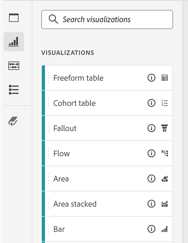
Open the visualizations list and it is long. Line, bar, stacked bar, horizontal bar, area, stacked area, donut, scatter, histogram, treemap, bullet, combo, Venn, map, summary number, summary change, key metric summary, and several more underneath. It looks like a set of choices to be worked through.
It is not, really. Most analysis is served by four or five of them, and the length of the list is closer to a trap than an opportunity, because browsing it encourages picking something interesting. A chart has no business being interesting. Its entire job is to make one relationship obvious faster than a sentence could, and the shapes that do that best are mostly the boring ones.
The way to choose without thinking about the catalogue at all is to say the finding out loud first, in plain words, and then take the shape that matches the verb you used.
| What you said out loud | The shape | Why that one |
|---|---|---|
| "This is going up, and here is where it turned" | Line | Time along the bottom is the only convention every reader already knows |
| "These things are not the same size" | Bar, horizontal if the labels are long | Length is the one visual property people compare accurately |
| "One number matters more than the rest" | Summary number or summary change | A chart of a single value is a chart wasted |
| "These two groups overlap more than anyone thinks" | Venn | The only shape that shows membership of two sets at once |
| "We are tracking against a target" | Bullet | Built for actual against goal, which a bar cannot express |
| "Where did people go, and where did they stop" | Flow, Fallout | Covered in Fallout and Flow Analysis |
For a first pass the working rule is short enough to remember: line for time, bar for comparison, a summary number for the headline, and stop there. That covers most of what a business report ever needs to say. It is scaffolding rather than law, and the day you can explain precisely why a scatter or a histogram answers your question better than a bar would, use it and forget the rule.
There is one shape worth being actively suspicious of, and it is the one that gets reached for most. A donut asks the reader to compare angles, and people are measurably poor at comparing angles. Try it on the picture below: the same five values are drawn twice, once as a donut and once as bars, and putting them in order is a small task on one side and no task at all on the other.
A donut also stops working entirely somewhere around four slices, and almost nobody stops at four. The horizontal bar answers the same question, holds any number of categories, keeps its labels readable, and can be understood from the back of a room. If somebody asks for a pie chart because the last deck had one, this is the substitution to make quietly.
Two of them draw no data at all
Sitting in the same list, easy to scroll past, are two components that plot nothing whatsoever. Text puts a paragraph on the canvas. Section header puts a heading on it. Neither performs any analysis, neither touches a report suite, and between them they do more for a project's usefulness than any choice of chart.
The reason is worth spelling out, because the failure they prevent is so ordinary that most people have stopped noticing it. A project built over an afternoon of genuine investigation is completely legible to the person who built it. They remember which question each panel was answering, why that segment is applied, and what the odd-looking table in the middle was for. Hand the same project to a colleague a week later and none of that is present. The tables are all still correct. The charts are all still accurate. And there is nothing anywhere on the canvas that says what was being asked or what the answer turned out to be, so the colleague reads forty numbers, forms no conclusion, and closes it.
Which is how a good piece of analysis ends up being opened exactly once.
Put a text block above each panel and write, in one plain sentence, what that panel found. Not what it shows, what it found. "Mobile converts at half the rate of desktop, and the entire gap is in checkout" is a finding, and the bar chart underneath is the evidence for it. Most projects ship the evidence and leave the finding in the analyst's head, which is why so many of them get read once and never reopened. The habit pays a second time months later, when you come back to a project and the sentence tells you immediately whether it is still worth keeping, without having to reconstruct what you were thinking at the time.
Follow along: build three pictures, then break them on purpose
The attachment between a chart and its table is easier to trust once you have watched it work and then watched it fail, and the failure is much better met in a project nobody depends on.
- Part one, attachment
- Start with a panel holding one freeform table:
Dayin rows,Page Viewsin columns. -
Open the left rail ›
Visualizationsand drag aLinechart underneath it. It arrives already populated. Nothing was configured. It went looking for a table and found yours. - Add a
Barchart and aSummary numberthe same way. - Now change the table: swap the metric, or drop a segment on a column. All three pictures move together, and none of them was touched. That is the whole mechanic in one action.
- Part two, the break
- Insert a second freeform table above one of the charts. Check whether that chart is still reading the table you think it is. It may not be.
-
Open that chart's settings ›
Data Sourceand point it deliberately at the table you actually mean. This is the only place the relationship is visible. - Delete the original table, watch what happens to the charts that were drawing from it, then undo straight away. Remember the shape of it. That is what a broken data source looks like when it happens to somebody else's project.
- Part three, make it readable
-
Open the left rail ›
Visualizations›Text, and drop it above the panel. Write one sentence saying what the panel found. Not what it shows. What it found.
There is nothing else to configure. A visualization has almost no settings of its own, because nearly every decision it displays was already made in the table it is reading.
There is more to each of those steps, though not much more that matters. Step 7 is the one worth doing deliberately, so that the first time a chart empties on you it is a thing you recognize rather than a thing you panic about with a stakeholder waiting.
Every chart is a drawing of a table
Every visualization in Analysis Workspace is a drawing of a freeform table. It holds no data, it inherits every decision the table made including the ones you have forgotten about, it attaches itself to whichever table happens to be nearest unless you tell it otherwise, and it empties without complaint when that table goes away. The Data Source tab is the only place that relationship can be seen, and checking it before deleting anything is the difference between a project that survives being edited and one that starts describing the wrong subject.
Choosing among two dozen shapes matters far less than the catalogue suggests. Line for time, bar for comparison, a summary number for the headline, a sentence of text saying what was found. Most of what makes a project persuasive is not in the list of visualizations at all, and the components that plot nothing are doing more work than the ones that do.
Four entries in that same list are different in kind, though. They do not draw an existing table, they run an analysis of their own, and each one answers a question a freeform table cannot express however it is arranged. Cohort Analysis is the first of them, and it stops asking what happened this month in order to ask something harder: of the people who arrived in January, how many were ever seen again.
Analytics > Workspace, then the Visualizations icon, second down the left rail. Drag any entry onto the canvas, or use Insert in the menu bar above.
Every visualization carries a gear for its own settings, and Data Source inside those settings is where the link to a freeform table is shown and changed. It is the first place to look whenever a chart shows something unexpected.
This article focuses on the concepts, architecture, and practical guidance behind the topic. For the latest UI walkthroughs and step-by-step implementation instructions, use the links below. They leave this site and open Adobe's own documentation in a new tab.